Almosafer is the Middle East’s leading travel brand offering consumers seamless travel experiences for travel bookings through its omni-channel offerings across state-of-the-art online platforms.
Provides hotel booking options for over 1.5 million properties around the globe and flight bookings on over 450 airlines, complete holiday packages, car rental, transfers and more.
UX / UI Project
Almosafer
Role
- I have created UI Visuals and led the product design and UX process.
I collaborated with a product managers, a product marketing and the development team to research, scope, plan, execute, define fixes and prioritise.
Problem Statements
- The hotel and flight ticket booking application needs a smooth user experience. In order to create a successful app, we first need to implement a full process of understanding what the user's pain points are and address them through intentional design.
Project Goals
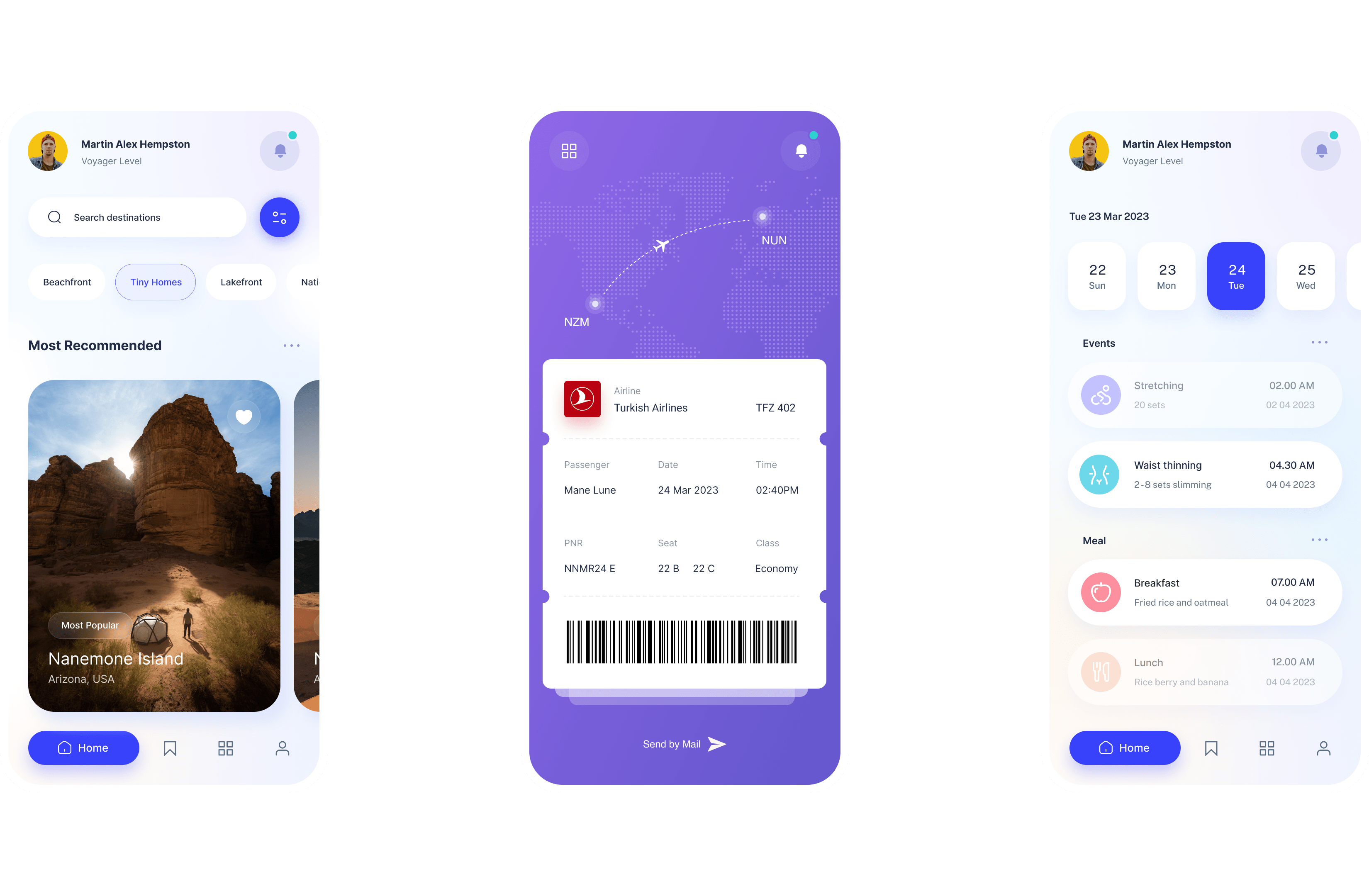
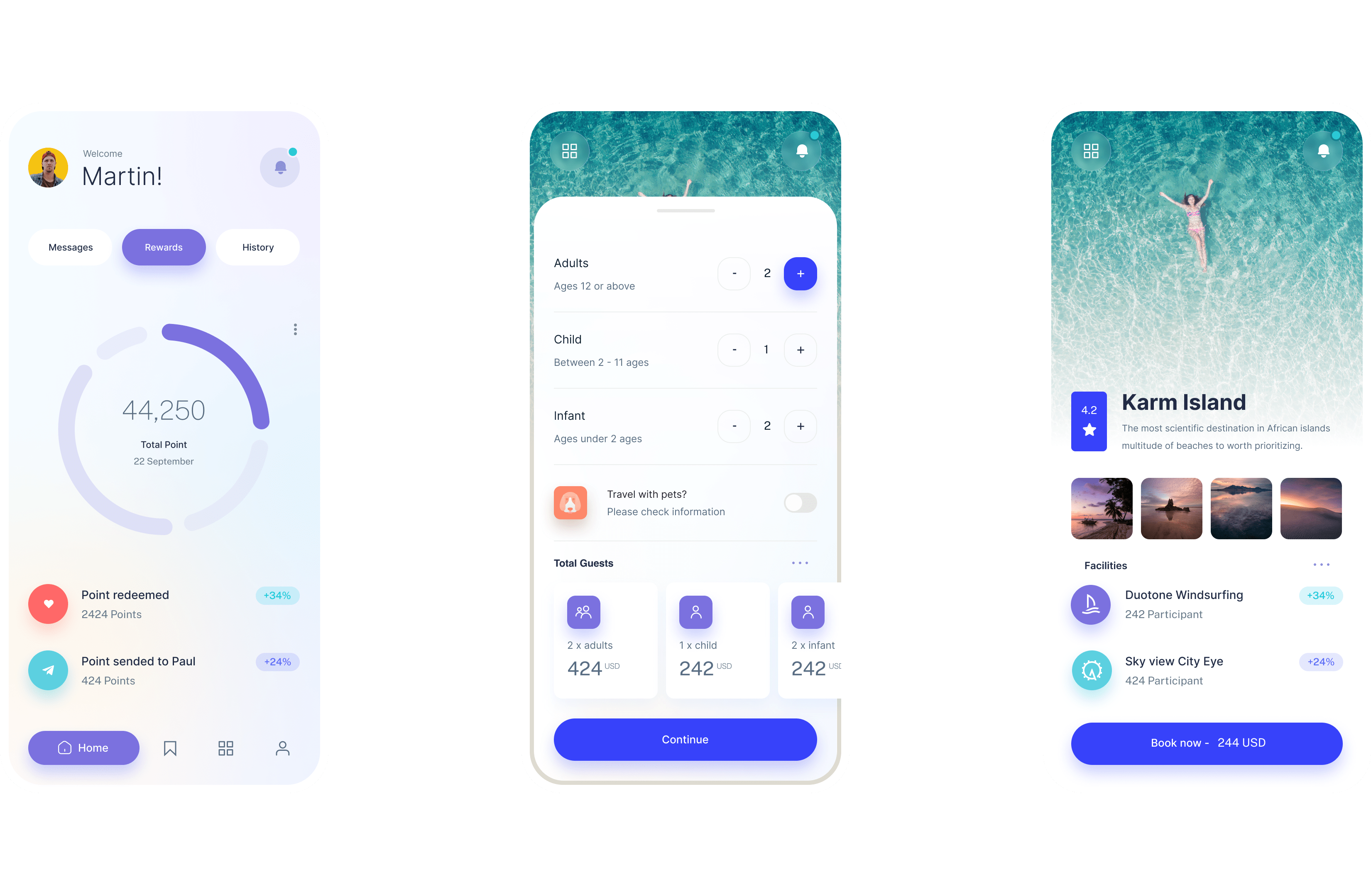
- The goal is for users to plan their entire trip and make all their reservations such as flight tickets and hotels without the need to use more than one application.
You can't understand good design if you do not understand people; design is made for people.
Competitive Benchmarking
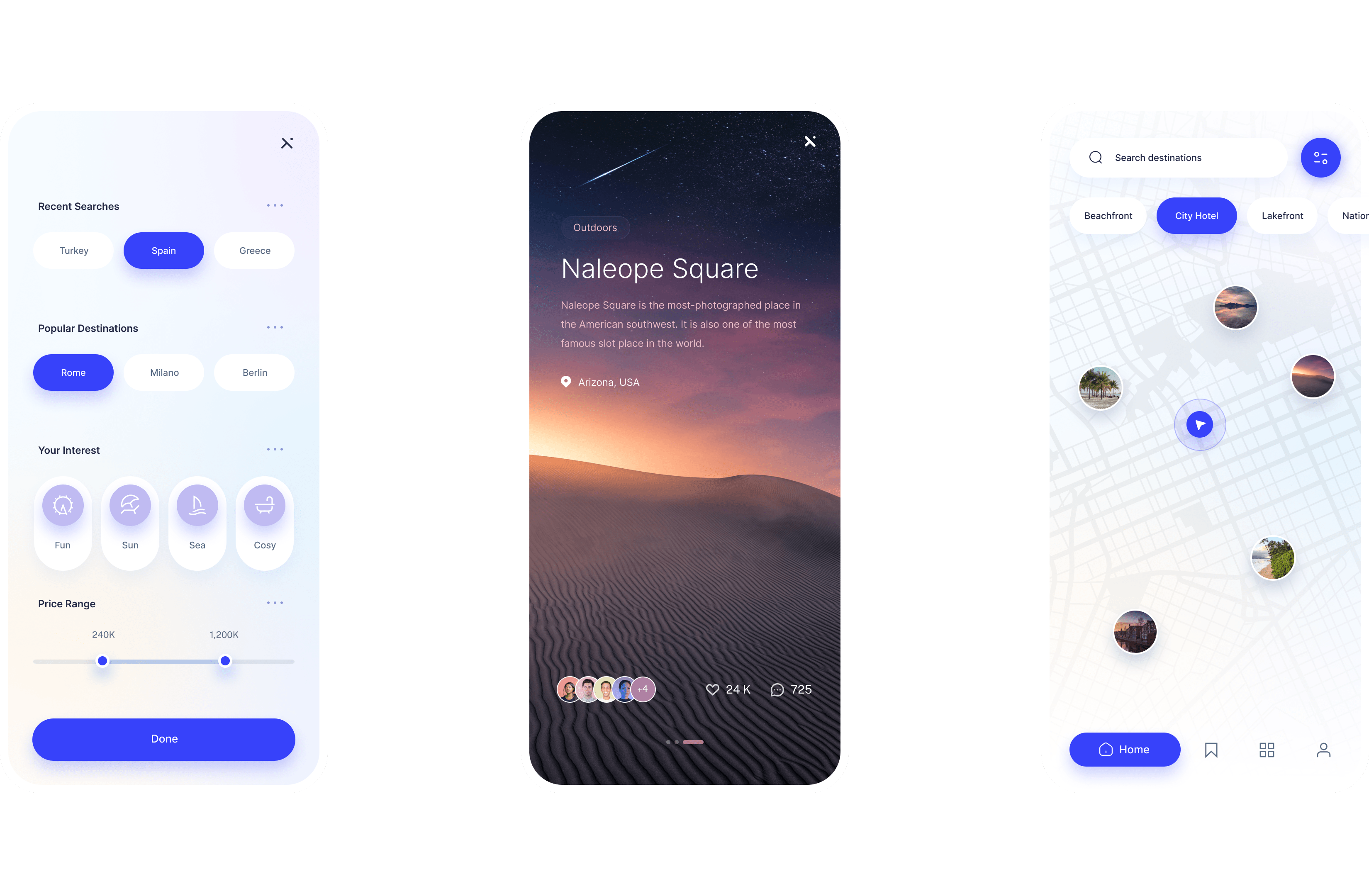
I have reserached how other apps are addressing the problems I was trying to solve for this specific case study and finded out about patterns that work and the areas for improvement (or to be avoided altogether.) Interaction designs need to be simple, yet effective so I rided of any clunky user experiences. Information should be organized in a logical and intuitive way. Smart layout design paired with convenient features can go a long way and prevent the user from feeling overwhelmed.
It's not enough that we build products that function; we also need to build
joy, excitement, pleasure and fun.
Research: Understanding Users
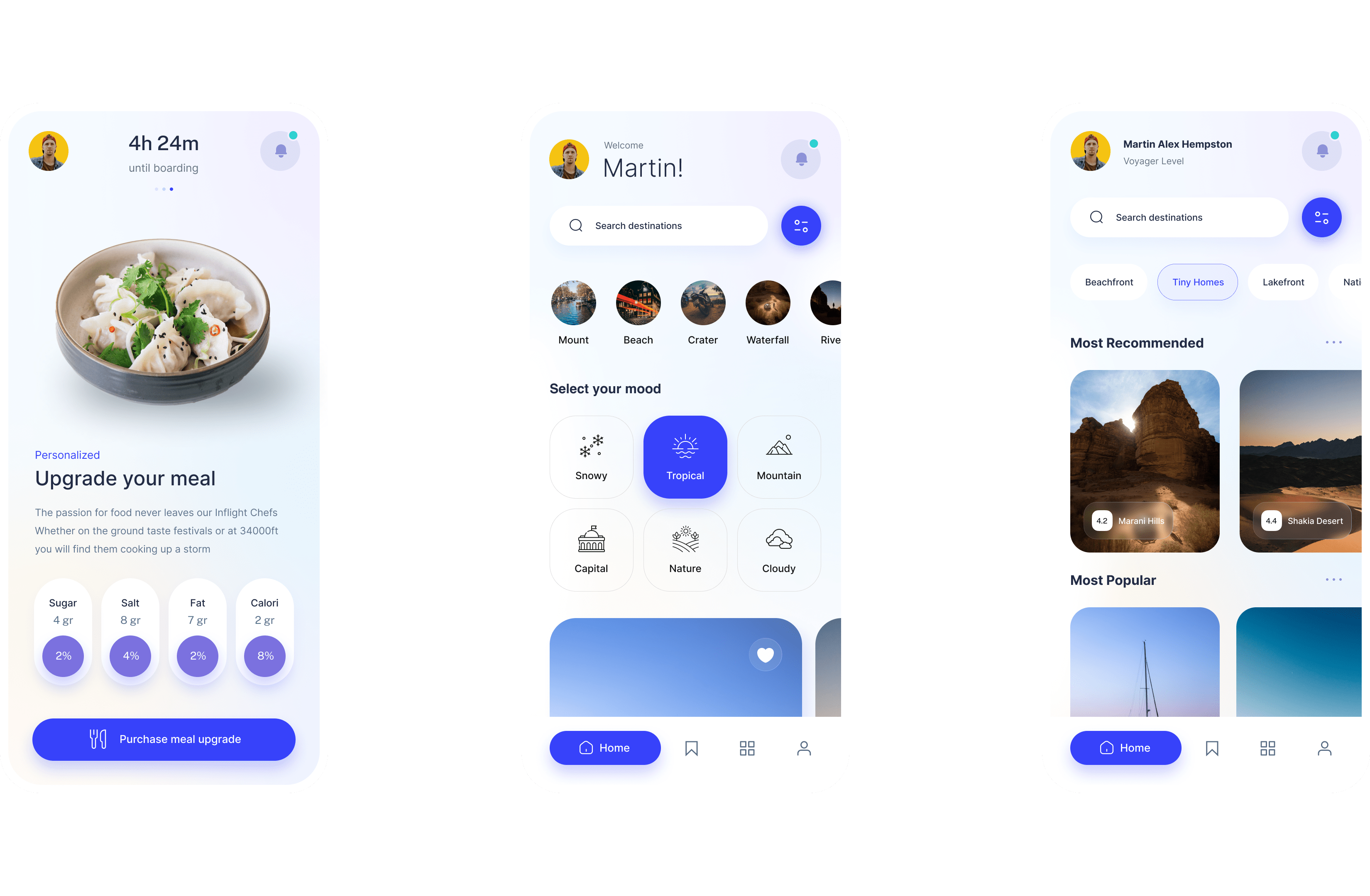
Most people go on a hotel booking app to make a reservation for an already pre-planned trip. Folks often struggle with interactive features such as using the filter feature, selecting add-on’s, and getting through the room selection process. Some folks have pointed out that certain booking applications can look too cluttered and confusing. Users often felt overwhelmed by the sheer amount of information on the tested applications. There was a trend of users wanting to be able to confirm desired amenities, hotel policies, and price very early on in the consumer journey. Confirming add-on’s and room details was not intuitive. Users were not able to easily verify desired amenities or filter results.
You've got to start with the customer experience and work back toward
the technology.
Analysis: Affinity Diagram
The next step is to analyze collected data. The most credible way to break down such qualitative data is to create an affinity diagram to hopefully identify any trends and in the future, make informed design decisions.The trends we noticed were related to the following: Imagery, Navigation, UI/Styling, Search, User Habits, Promos, Price, Accessibility, Map View, Conveniency, Information, and Transparency. The way information was displayed was the most prominent trend, while brand integrity/transparency and conveniency came second. Moving forward when making design decisions, we needed to focus on showing as much information as possible about listings all while not overwhelming the user.
Good design is good business.
Simplicity is the ultimate
sophistication.
Conclusion
Convenience is Key: Time is precious and a user is most likely not going to enjoy excessively scrolling for important information.
Always Value Transparency: Gaining a user’s trust early on in the consumer journey will keep them around much longer.
Keep it Simple and Logical: Folks can quickly feel overwhelmed by cluttered interfaces or wordy descriptions. Rely on basic design principles to create clean and smart layouts- organizing information in a way that is intuitive to users.