Turk Telekom Muud app is a music streaming and digital entertainment platform offered by Türk Telekom, leading telecommunications company in Turkey. Muud is designed to provide subscribers with access to a wide range of music content, including songs, albums, and playlists, as well as additional entertainment features. Muud also offers its members music news, music lists and videos tailored to various moods.
Muud announced its collaboration with Facebook in 2012 and integrated its service with the popular social network Facebook.
UX / UI Project
Turk Telekom Muud
Role
- I have created UI Visuals and led the Product Design and UX process. I collaborated with stakeholders and I was responsible with research analysis, concept development, user centered design and functional design, aesthetic, prototyping.
Target and Challenges
- As users, get the right music player app which understands our taste and suggests the right kind of music from the vast ocean of songs, genres, artists and more.
Problem Statement
- Design a music streaming app, to curate and cater to the user’s specific tastes through its algorithm and interface, and to make sure that its machine learning functions improve over time and with frequency of usage.
Design is not just what it looks like and feels like. Design is how it works.
User Research
I adopted one of the primary methods for conducting the user research- user surveys, with a survey size of 100. The motive behind selecting research method was to get a quantitative data to identify the user tastes, behavior and preferences. The survey form which I prepared covered a range of questions. At the same time, to get a clearer vision for the features, functions and flows, I adopted the method of competitive analysis. I listed out some important features of existing apps and compared them thoroughly.
A user interface is like a joke. If you have to explain it, it's not that good.
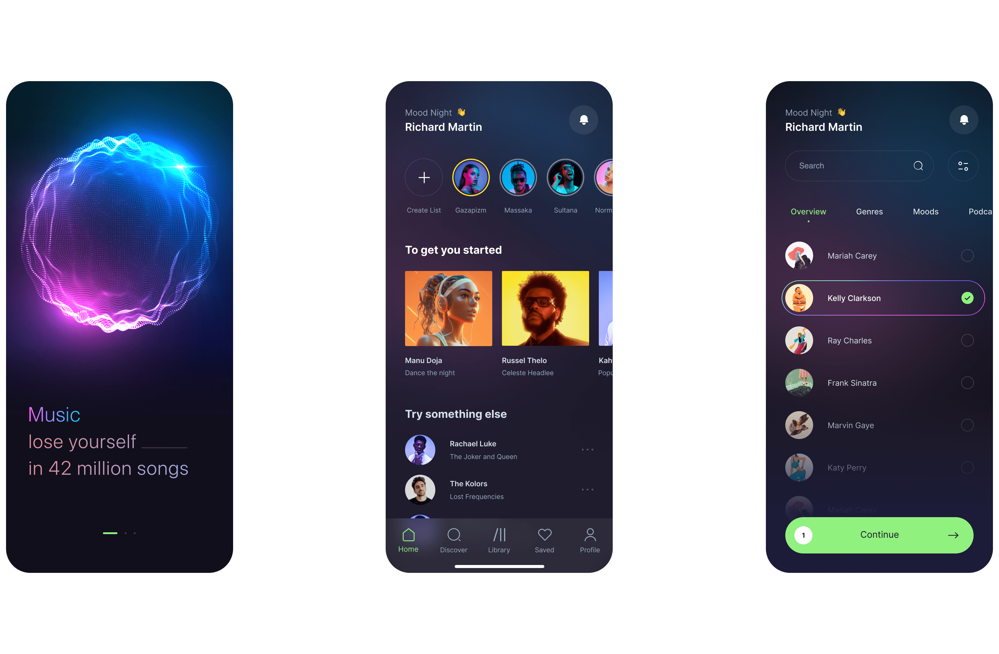
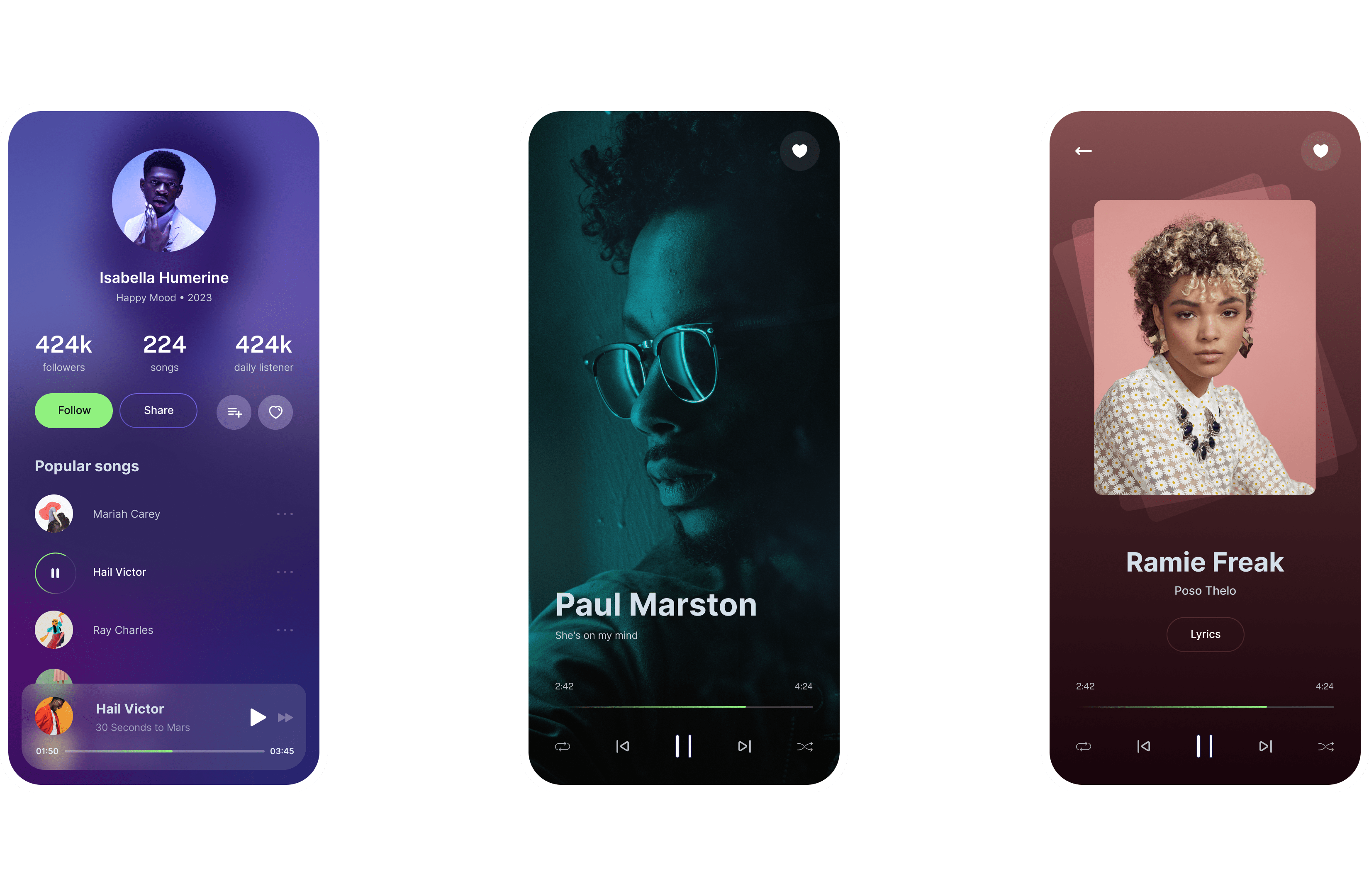
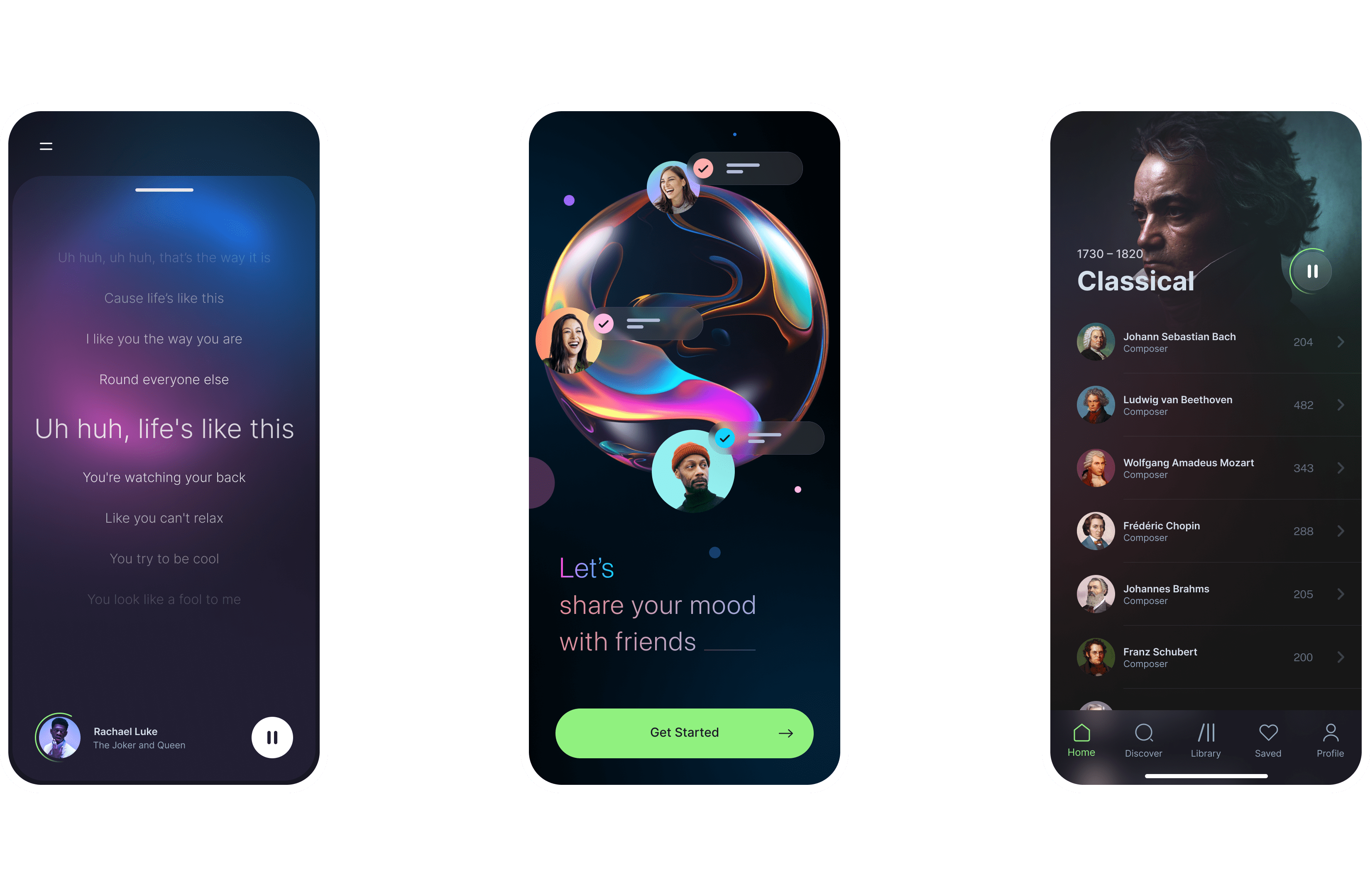
Proposed Solutions
During onboarding, the app can ask questions to know the user taste in music so that it can give appropriate suggestions. According to the user behavior, we can prioritize the content and make it clearly visible for the user to select. Otherwise, users face the problem of choice overload and eventually lose interest in using the app. Making the lyrics available for all the songs uploaded on the app. Taking into considerations all of the faults in old design, I recreated the new design with the necessary changes, added new features, animations, micro interactions and made it more desirable and efficient to use.
The details are not the details. They make the design.
Key learnings
For complex workflows, hierarchy is king — Making the implicit structure of the app concrete in the interface made onboarding users way easier. Building on familiar patterns is amazingly useful — Once we found an interaction pattern that was familiar to most users, everything else flowed way easier.
Don’t hide controls — Anything that will add value to the user should be clearly visible. Features that are only revealed by swiping need to be clearly labelled, and highlighted during onboarding. Even then, users will miss them.